
Airline Livery: The Story Behind What Airplanes Look Like and Why

By Samantha Butts
Customers may not consider the insignia and design of a plane before purchasing tickets, but after their flight, the livery will stick with them.
Each aircraft livery starts with hundreds of ideas and concepts, most go unseen by the client. The design starts with broad themes that they then work to narrow down. The goal is to bring the theme or motif to life with a graphic element or a symbol.
Overall, livery is a branding opportunity. Patrick Smith, an airline pilot, said, “the airplane itself acts as a kind of flying billboard.” It places that brand identity in front of passengers all around the world.
Livery helps separate one brand from another and the individual paint scheme gives brands distinctive looks.
Getting to the final product
The first step in working on an airplane’s livery is producing impressive mock-ups, says Edmond Huot, founder of Forward Media and designer of the Northern Pacific Airway livery.

The inspiration for the design comes from extensive research on the brand and market. Designers start with hundreds of ideas with abstract themes and motifs. They eventually bring it down to one or two designs.
Crazy Plane Paint Jobs You Won’t Believe
From there, Huot will hire a render to take the flat design and turn it into a three-dimensional rendering.
Huot shows the aircraft from many different angles to ensure the client can see their brand vision come to life. Once the design gets the “thumbs up,” it moves into the production stages.
Designers have to pick the exact colors and order them, while at the same time turning the livery design into a blueprint. These are dry documents, according to Huot, that are numeric with markers showing exact distances for the design.
While working on the Northern Pacific airline’s livery, Huot himself went to South Carolina to the factory that produced the paint to ensure they picked the right shades of gray for the aircraft.
The livery process with Northern Pacific took around two to three months. However, the project as a whole, including creating the design, painting, and launching the aircraft, took up to a year.
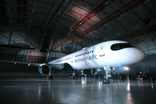
The story behind Northern Pacific Airway’s livery
“I look at liveries as stories, so I never look at it as just a simple design,” said Huot. He looks at what the livery is trying to communicate.
For Huot when designing Northern Pacific, the goal was to understand the brand and showcase that. Many of the designs on the aircraft are inspired by motifs that are authentic and indigenous to the land the airline is from. In this case, Alaska is the muse.
The white of the plane was inspired by the pure white snow and the black came from the rock of the mountainous ranges. The turquoise gradients on the winglets, within the letterform, and on the tail represent the northern lights.
“We wanted something that the rest of the world would understand,” said Huot. “We wanted something that Alaskans would see and feel great about.”
What is the biggest issue in the livery industry?
According to livery enthusiast and pilot Patrick Smith, many designers are simply trying too hard to be clever.

Smith said that while the designs are attractive, they are missing the mark when it comes to presenting a brand. There are too many shapes, textures, and colors. He said, it “gets lost in a blur.”
As a child, Smith remembers being able to look up and identify each aircraft by its design. Now, this is no longer the case. Smith said, they all look similar and from a distance, it is difficult to see the design.
What are the worst liveries according to Smith?
Smith named a few that sit at the bottom of his livery list, but he also has a growing list on his website called, “The Rolling Report Card” where he grades livery.
First to his mind was Egypt Air. Smith said the airline previously had a dignified livery but was “nothing spectacular” although it delivered the brand. Now, Smith describes it as, “the most overwrought tacky design maybe in the sky. It looks like the uniform of an amateur hockey team.”

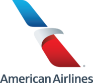
Another airline that comes to mind for Smith is American Airlines. While their livery is not bad he said, what they did to their logo was the single biggest travesty in the past 10 or 20 years. The airline changed from their double “A” logo with the eagle bisecting the two letters.
Smith said they “came up with this grotesque symbol that in some ways it looks like it could be the logo for a bank or a credit card company but when you really look at it, it looks like a linoleum cutter.”
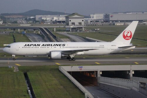
When it comes to his favorite livery design, however, Smith has chosen Japan Airlines, JAL. The design, Smith said is, “very clever but also just simple, elegant, almost perfect.”
What makes the best livery designs?
According to Smith, the most effective liveries are ones a child can draw from memory. It does not need to rely on texture, color, or complicated patterns.
“It should be something elegant.,” he said. “But relatively simple, easy to reproduce.”
When it comes to lettering, airlines have lately been going with “billboard titles,” which put the name of the airline in large letters, filling up the white space. 
Smith suggests these airlines use smaller lettering. They are more dignified. While you want your brand to stand out, “you don’t want to rub people’s faces in it either,” he said.
For the future of airline livery, Smith hopes to see classic elements brought back. There are a lot of old elements that have been lost and could resurface. The best logo design characteristics are Simplicity, Relevancy, Unforgettable, Timeliness, and Versatility, according to Site Pro News.
John K. Morton wrote, Lost Airline Liveries: Airline Color Schemes of the Past, which highlights the change of livery over time and displays lost color schemes and designs. Perhaps livery designers can look back to these classic designs for their next inspiration.
- Norse Atlantic Airways: A New and Affordable Airline - March 27, 2023
- Robots in Action: Airports Bring on the Ottobots - October 10, 2022
- A Quest in New York City for the Best Croissant - July 25, 2022


Wow! Lots to think about next time I’m on a plane!